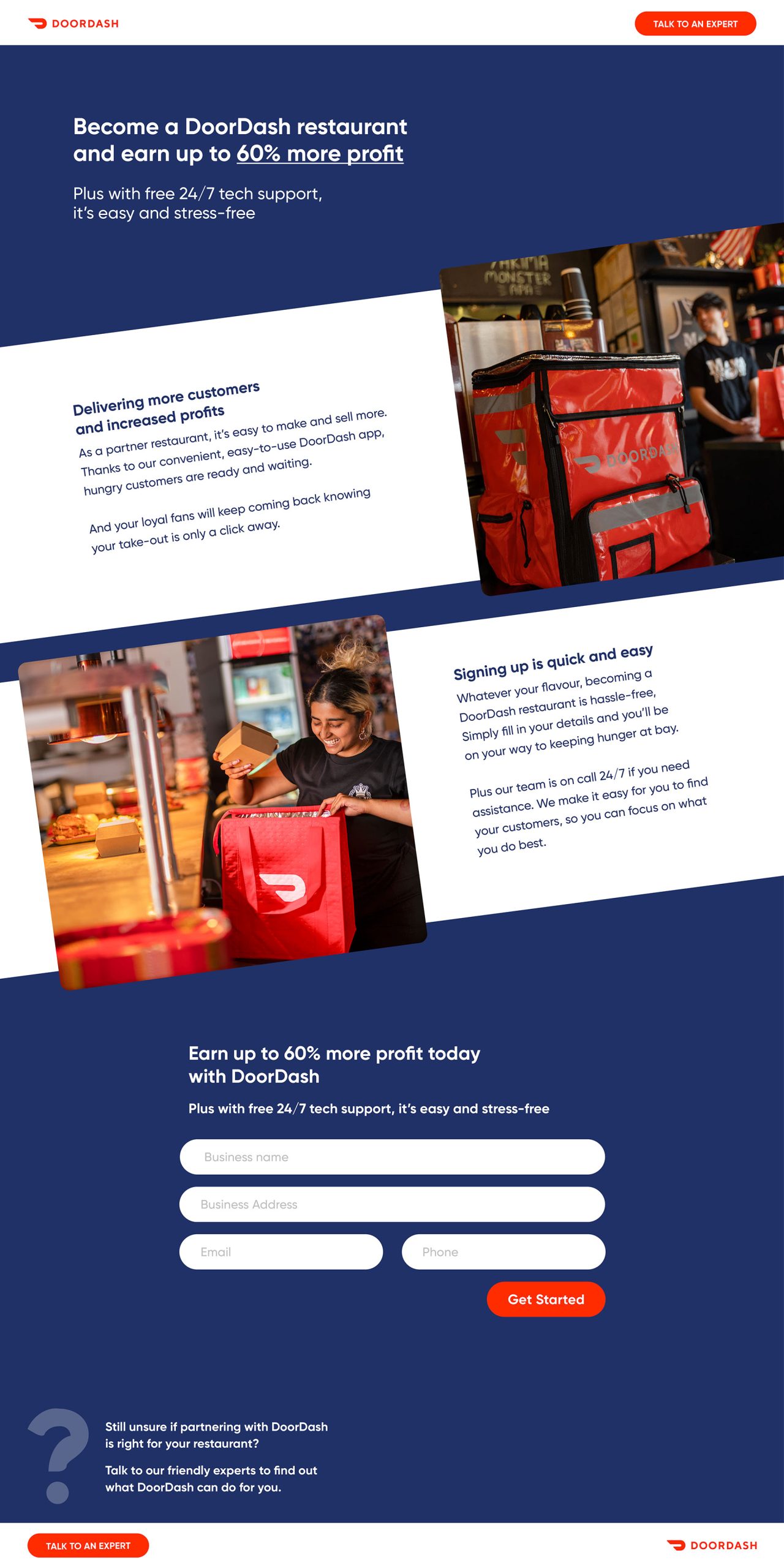
DOORDASH LANDING PAGE (SPEC)

Client:
DoorDash is a technology company that specialises in connecting hungry customers to online restaurants, convenience and takeaway stores. Through their purpose built app, customers can browse a selection of online restaurants and order food for either delivery or pick up.
Challenge:
To design a landing page that will entice local fast food restaurants to sign up as a DoorDash delivery partner. The takeout restaurants targeted already have a small loyal following of customers but these restaurant owners are sceptical of new technology and mainly rely on free Facebook posts to promote their food.
Solution:
The main benefit to potential new restaurants signing up ("up to 60% increase in profits") is placed front and centre to immediately capture attention.
The reptition of words such as "stress free" and "easy" is important to reduce scepticism and remove barriers in signing up. I also wanted to stay true to the DoorDash "casual Friday" tone and incorporate professional, yet friendly language to further emphasise DoorDash's approachability and ease of service.
The reptition of words such as "stress free" and "easy" is important to reduce scepticism and remove barriers in signing up. I also wanted to stay true to the DoorDash "casual Friday" tone and incorporate professional, yet friendly language to further emphasise DoorDash's approachability and ease of service.